Related Posts
How to make your website more user friendly and effective
It’s often the little things that make the difference and in the case of a user visiting your website there are many touches that whilst often overlooked on many sites can vastly improve the experience a user has when visiting your website.
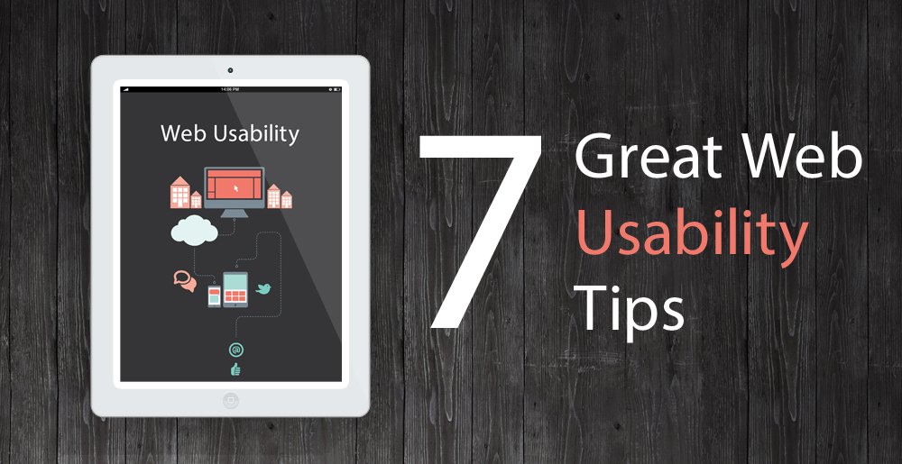
A good user interface design will result in higher conversions and will also be easy for your users. This provides a win-win situation where it is friendly to both your business goals and your potential online customers. Here is a list of 7 ideas that can help to make the most of the website experience for your users.
Single Column Layouts instead of Multi Column Layouts
A single column layout will give you more control over the sequence of information you present to the user. A one column narrative will be able to steer your users in a more predictable route from top to bottom. Using a more classic multi column approach adds the risk of distracting the core message of a page and enticing the user to other pages that capture their interest. If you can guide people through your page in a series of connected sections with a prominent call to action at the end you should find the page more effective and intuitive.
Give away something of value rather than going for the immediate sale
If you are finding that users to your site are not purchasing or contacting you about your services, try giving away a gift. Being generous and offering something of use will increase trust between you and the user. Based on the laws of reciprocity this approach will help to persuade users to engage with you.
Experiment with social based endorsements
Social recommendations are another effective persuasion technique that will directly increase your conversion rates. Seeing that other users are also recommending you and talking about your products can be a powerful way to impact a call to action. Try a section of short testimonials or showing data from social sites that proves that others love what you do. For online selling, third party services such as trust pilot are very useful as the trust ranking is also shown in Google results.
Use multiple calls to action to emphasise your main conversion point on longer pages
Repeating a call to action button is a good strategy that is best applied to longer web pages, or across a sequence of multiple pages. If you have a short page where most content fits above the fold, then a single call to action area should be effective. However, on longer pages (which are now much more the norm since the idea of compressing everything above the fold is dwindling) multiple calls to actions can be placed through the content stream. Placing an actionable button and message at the top, and another prominent one at the bottom of the page is a good starting point. When people reach the bottom of an article, they consider what to do next which makes this a good place to make them an offer, give something away or make a sale.
Talk about your location
If you are transparent and open about where you, your product or service are from it says quite about your business on a number of levels and also moves the communication onto a more personal level. If you through the course of the narrative you can discuss the relevant country, town and place it becomes a very natural way to introduce yourself just as you would when first meeting a new colleague or customer. If you are able to achieve this in the virtual online world then you are sure to appear more friendly and approachable than those that don’t. In many cases talking about where the product is made and by who also gives the impressive of high quality so it is beneficial in multiple ways.
Recommendations and choices help the user
It is often helpful to the user to show comparative information. This allows them to pick the option which most suits their own requirements. Too much choice can be off putting though, so try to have less than five options and when showing these multiple options, an emphasized suggested option might be a good idea to help people make the decision e.g give the recommended option a larger section and add a flash saying ‘Our Customers Most Popular Choice’.
Be clear who it’s for rather than broad and blunt targeting
Experiment with being absolutely clear in your message who the product or service is for. You are sure to gain the attention of the user if you can be specific and match their own circumstances. By communicating the criteria of your customers, you might manage to connect more with them and also give the impression that your offering is exclusive to them. The risk with this approach is that you may worry you are losing out on missed opportunities and are too exclusive. If it works for one targeted group of users you can then create multiple versions targeting different types of users and highlighting the relevant benefits to each group.
It is worth testing a few of the ideas above to see how you conversion rates respond and most of these approaches also working in printed mediums as well as online.


