Our challenge
HOSPA came to us to help position their newly renamed association as a forward thinking and technology inspired hub of knowledge, industry news and event organisers. The new brand was to be used across print and digital mediums plus alongside this have a sister identity (HOSPACE) which would be used for their annual industry event.
The solution
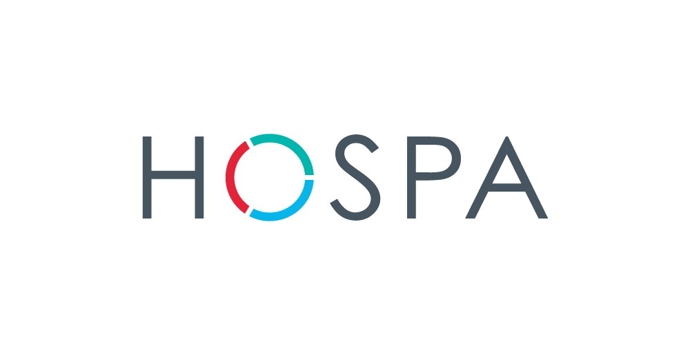
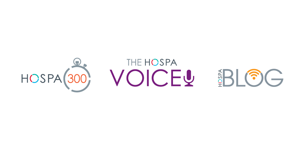
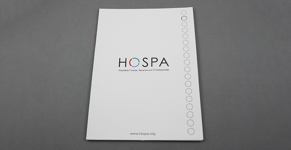
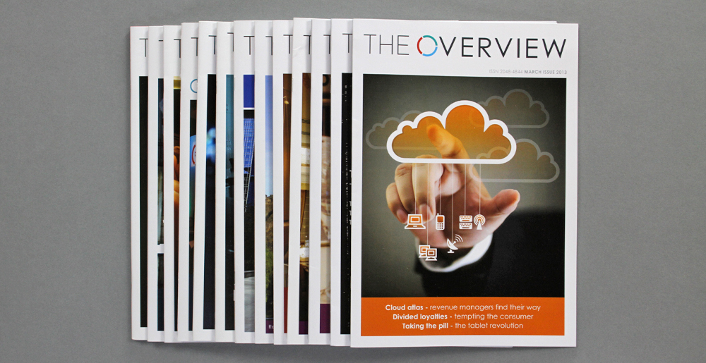
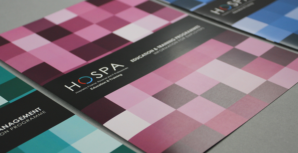
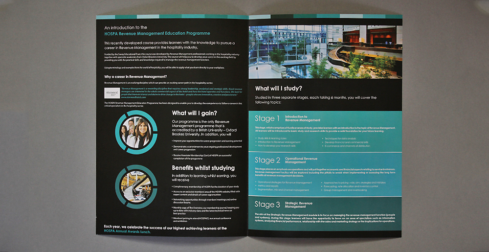
As the association is made up of three distinct sectors within the hospitality industry we created a community section for all of these and this formed the basis for a colour coded identity. The identity represents each sector with each of the broken 'o' segments together making up the collective community. This device is also used effectively in their monthly publication "The Overview" and in the sister brand HOSPACE.
The results
The new brand identity has given HOSPA a much more professional and contemporary stance that has been adopted and well received by the existing members but also given HOSPA a firm platform to connect with new professionals in the hospitality sector and providing them with news and knowledge.