Related Posts
Why Mobile matters
Mobile internet usage is here to stay. Of the worlds 4 billion mobiles , 1.08 billion are internet capable smartphones. By 2014 mobile internet is on target to over take traditional desktop computer use. This new breed of internet users are accessing the web in a very different way to desktop users. They may be at work, out and about, traveling or watching television (86% of mobile internet users are now using their devices whilst watching television). This means that the way they interact with the internet is more varied than ever before and we now need to consider the context in which a mobile internet use may be accessing our websites and other online destination such as our Facebook and Twitter pages.
So what are the main differences between a mobile users and desktop users?
Our mobile devices are personal. They contain personal information, messages and photos. We take our mobiles everywhere and they are almost always on and connected to the internet in some form.
Instead of sitting down and accessing the internet on a desktop machine for a hour or more, mobile users are accessing internet content in short bursts during the day. Their mobile device may be the first thing they see in the morning and last thing they check before going to bed.
91% of mobile internet access is to socialize compared to 79% of desktop access desktop, and women aged 35 – 54 are the most active group in mobile socialization.
Mobile devices are location aware and Google is providing local based search results in response to a half of all local searches being performed on a mobile device. A local search may be for many different things including direction finding, weather, user reviews or travel times.
So we now need to consider how we can adapt or rework our websites to suit a mobile user and to address their most likely needs.
It is not necessarily enough to just convert your existing content and change the screen sizes of a site to suit a mobile platform. The greatest impact of whether our mobile sites are effective are the context in which they are being used. Some questions to ask yourself in order to help ascertain the most useful site content for a mobile user are, where is my user, what are the doing, who are they with, what connection speed might they have, how might be otherwise distracted how often might they access my site for.
What are the options for upgrading your site to be suitable for mobile:
The most cost effective way to update your site is to perform an audit of your current website code and ensure it is compatible with mobile devices. The disadvantage of this approach is that your content is not tailored to the mobile user in anyway in terms of design layout and content heirachy.
Responsive Website
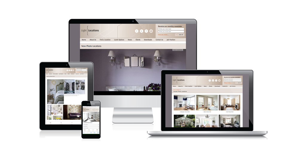
A responsive website design is able to adapt to whatever device it is being viewed on. Whether that is a desktop computer,tablet or mobile device, the same website will display the same content using a visual design most suited to that device.
This approach will suit information rich websites so that users coming to the site who are looking to find out information can do so using an optimized layout suited to their device.
Native Application (Iphone App, Andriod App)
Native apps are applications that are downloaded and then run physically on the mobile device. They are designed and coded specifically for the operating system of that device. These are the applications you typically find in either the Google Play or iOS App Store. This is a good approach where speed of use and features that are within the device are required (e.g. the camera, the accelerometer or the devices processing power and memory. This means the user will should get a very good user experience and as the app is downloaded on the phone itself there is no barrier to future usage. The disadvantage to this approach is that an app needs to be created per device and so costs are higher.
Web Application
A web application is similar to both responsive website and native applications, but also has key differences. In the same way as a responsive website it is built using website technology and is accessed via an internet connection, the main difference is that the functionality is more task focused like a Native App. So the app may provide customer services, ecommerce or useful tools. The advantages to this approach is that one application will run across difference devices and the app will be downloaded to a users mobile device so it is easy to access regularly.
When considering your mobile options the best place to start is in understanding your mobile audience, the how, where, when and why they may need to access your content and what it is you want to achieve when they do access your site. It is easy to think you may want an iPhone app, but this may not be the best approach, and it is worth considering the other options first.


